In this story
- Distinguish Between Product Name, Rectangular Diagonal, and Actual Viewable Area
- Device Dimensions and Weight Determine Carrying and Placement Methods
- Shared Configurations Are a Starting Point for Comparison, Not a Performance Guarantee
- How the Text Size Slider Works on the Two Sizes
- How Bold Text and LiquidGlass Tint Affect Reading Density
- "More Space" Is Limited to Specific Models and Changes Layout Density, Not Resolution
- Windowed app setting: a hands-on step you must try before choosing a size
- Adjusting the bottom-right corner, moving from the top, and shrinking from full screen: three actions that define your daily workflow
- Opening a second app, and the real limitations of multiple windows for the same app
- Side-by-Side Windows and the Divider Determine Whether Two Pieces of Content Can Be Worked on Simultaneously
- SlideOver’s Entry, Exit, Hiding, and Replacement Address the Need for Quick Glances
- Center Windows in Mail and Notes Open a Single Item Without Changing the Current View
- Stage Manager groups are collections of multiple windows for the same task, not a guarantee of multitasking capability
- The Recent Apps list and switching groups are fast channels between tasks, not a guarantee of background residency
- Understand Keyboard Footprint First, Then Assess Size and Input Method
- Floating Keyboard Movement and Slide-to-Type, Unavailable for Some Languages
- Split Keyboard and Undocked, Verify Applicable Models First
- Steps for Connecting an External Display: First Confirm Cable and Port Types
- Switching the Video Source on an External Display Does Not Change the iPad's Native Operating Logic
- Charging and Power Supply for External Displays: Do Not Confuse iPad Video Output with Mac Sidecar
Distinguish Between Product Name, Rectangular Diagonal, and Actual Viewable Area
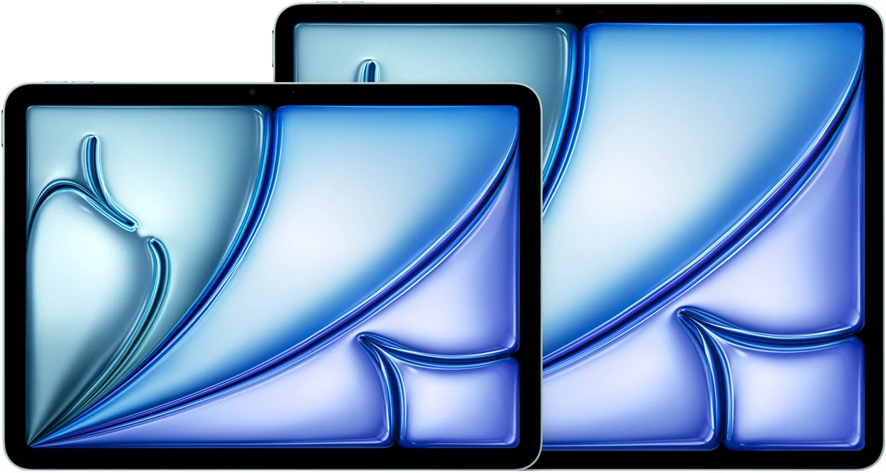
Apple refers to the two M4 iPad Air models as 11-inch and 13-inch. According to official specifications, when measured as a complete rectangle, the diagonals are 10.86 inches and 12.9 inches, respectively; the displays have rounded corners, and the actual viewable area is smaller [1]. The rectangular diagonal is a measurement standard and cannot be conversely cited as the true viewable area within the rounded corners.
The resolutions of the two screens are 2360×1640 and 2732×2048, respectively, with a pixel density of 264 ppi for both. Their aspect ratios are not identical, so one should not simply subtract 11 from 13 and treat the result as an increase in viewable area or work efficiency. How many lines of text a page can actually display is also affected by font size, app layout, and window width; the following text will explain these factors individually.
Choosing a size requires answering two questions. The first is how the content you want to view is arranged, and the second is how the device will be carried and placed. Paper dimensions can aid initial screening but cannot replace the actual experience of reading text, typing, and holding the device. This article is based on official specifications and the iPadOS 26 user guide verified on September 10, and does not present these operational suggestions as measured results.
Device Dimensions and Weight Determine Carrying and Placement Methods
The differences in the physical dimensions of the two iPad Air models directly affect what kind of bags they can fit into and how much space they occupy on a desk. According to official Apple data, the 11-inch iPad Air has a height of 247.6 mm, a width of 178.5 mm, and a depth of 6.1 mm. The 13-inch model has a height of 280.6 mm, a width of 214.9 mm, and the same depth of 6.1 mm. The identical device depth does not prove that the same accessories are universally compatible; protective cases and keyboards still require verification of their dimensions and model numbers.
Regarding weight, the Wi-Fi model of the 11-inch iPad Air is 464 grams, and the Wi-Fi + Cellular model is 465 grams. The corresponding weights for the 13-inch are 616 grams and 617 grams, respectively. The cellular model is only 1 gram heavier than the Wi-Fi-only model; the specifications sheet does not explain the source of this difference, nor can one infer individual perception from it. However, the weight difference between the 11-inch and 13-inch is approximately 152 grams; this comparison is for the bare device weight and does not include a protective case or keyboard. When choosing, users need to consider their daily carrying method. If you are accustomed to placing the iPad in a tote bag or briefcase you carry with you, the 13-inch model's width of 214.9 mm requires the bag's inner pocket width to be at least this size, leaving room for edge protection. Whether the 11-inch model's width of 178.5 mm can fit into your own bag also requires actually measuring the opening and inner pocket dimensions.
In desktop usage scenarios, the 13-inch iPad Air, when set up, occupies more lateral space. If a user needs to use it on a small tray table in an airplane economy seat, or on a narrow café table while also placing a drink, the 13-inch model might make the space feel cramped. Under the same conditions, the 11-inch model leaves more generous surrounding space. Paper dimensions can only help with a preliminary judgment of footprint; using a tape measure to mark out a 280.6 mm by 214.9 mm rectangle on your own desk can provide an intuitive sense of the area the 13-inch model occupies. The same method is also applicable for checking the supporting dimensions of bookshelves, kitchen stands, or piano music stands.
Shared Configurations Are a Starting Point for Comparison, Not a Performance Guarantee
Both Air models list an M4 chip, an 8-core CPU, a 9-core GPU, and 12GB of unified memory, offering 128GB, 256GB, 512GB, and 1TB storage options [1]. Size and capacity are two independent choices; one cannot assume more memory just because the 13-inch model was chosen, nor can these shared numbers guarantee identical real-world performance across all scenarios.
Both models support one external display up to 6K at 60Hz, providing DisplayPort output via USB-C [1]. This indicates the upper limit of external display capability, but verification of cables, the monitor, and actual applications is still required. It does not mean the reading space on the two built-in screens is identical, nor does it mean that connecting any monitor will achieve the maximum mode.
The 11-inch battery is 28.93 watt-hours, and the 13-inch is 36.59 watt-hours. Apple lists up to 10 hours of Wi-Fi web browsing or video playback, with up to 9 hours of cellular web browsing for Wi-Fi + Cellular models [1]. This is a manufacturer's metric under specific conditions, not a battery life measurement taken for this article, nor does it prove that battery life is identical for your work across the two sizes.
When choosing, one can note these shared specifications first, then look at the truly different dimensions, bare device weight, resolution, and brightness. The 11-inch is listed at 500 nits, and the 13-inch at 600 nits; the brightness number alone cannot guarantee outdoor readability, much less lead to conclusions about eye protection. Comparing with the same document, the same font size, and window settings brings you closer to the decision you need to make.
How the Text Size Slider Works on the Two Sizes
In iPadOS 26 Settings, text size is adjusted using a slider located under Display & Brightness > Text Size [2]. This slider does not change the physical pixel count of the screen, nor does it suddenly give the 11-inch or 13-inch display higher resolution. What it adjusts is the rendering size of text that supports Dynamic Type system-wide, meaning that apps that follow Apple's Dynamic Type specifications will respond to this slider, but not all text in all apps will change accordingly.
When comparing sizes, you can open a document you commonly use, record the current text size and actual display appearance, then repeat the same operation on the other size. Do not directly assume from pixel density that the same slider position will yield the exact same font size or a fixed increase in the number of lines; the app's layout will also affect the result.
If the text in a particular app does not change with the setting, check the app's own text settings and support documentation. Which content wraps after the font is enlarged, and whether window titles, body text, and charts all remain clearly readable, must be confirmed using actual files. The purpose of the comparison is to find a readable font size and suitable display space, not to make the slider positions look identical on both devices.
How Bold Text and LiquidGlass Tint Affect Reading Density
"Bold Text" is an independent toggle located in Display & Brightness settings [2]. Bold text and text size are two separate options and should be observed individually. The manual does not guarantee that line spacing or line wrapping will remain completely unchanged across all apps, nor does it provide conclusions about mis-tap probability or legibility. When testing, you can change only one item at a time, then examine the actual text and controls, to avoid being unable to tell which difference came from which setting after adjusting multiple options simultaneously.
The LiquidGlass appearance offers two options: "Transparent" and "Tinted" [2]. When "Transparent" is selected, some background areas of the system interface will exhibit a semi-transparent effect, allowing the color and texture of the underlying wallpaper to show through faintly. When "Tinted" is selected, the system increases the opacity of these background areas and enhances contrast, making the boundary between foreground text and background clearer. The official description states that "Transparent" provides a more transparent appearance, while "Tinted" increases contrast and opacity [2]. These are interface appearance options, not changes to the screen hardware; you cannot infer from the option name that a particular size is definitely more suitable for a certain environment.
It should be noted that if "Reduce Transparency" or "Increase Contrast" is turned on in Accessibility settings, the LiquidGlass appearance options will be overridden. Users need to turn off these two accessibility toggles first for "Transparent" or "Tinted" to take effect [2]. This article does not discuss whether these accessibility features should be turned off; it only states the conditional relationship given in the official documentation. When comparing the two sizes, users can set LiquidGlass uniformly to "Tinted," then open the same app with a sidebar on both the 11-inch and 13-inch models, and observe the boundary clarity between the sidebar background and the main content area. This comparison can help you judge whether, on a larger screen, "Tinted" makes information partitioning feel more distinct to you, or instead makes the interface feel dull.
"More Space" Is Limited to Specific Models and Changes Layout Density, Not Resolution
The "More Space" option under "Display Zoom" is not available on all iPads. Apple notes in the manual that this feature is only available on "supported models" [2]. For the M4 iPad Air, users need to go to Settings > Display & Brightness, tap "Display Zoom," and check whether the "More Space" option is present. If the option exists, it means the device supports it; if it is not seen, the system version and specific model documentation must be checked, and no permanent conclusion can be drawn based solely on the interface at this time. This article does not speculate on which models are supported; it only relies on the manual's description, and users should refer to the options actually displayed on their own devices.
When the user selects "More Space" and confirms, the system reduces the rendering size of text and buttons, allowing the screen to accommodate more interface elements without changing the physical pixels [2]. This process is not an increase in resolution; the screen's 2360×1640 or 2732×2048 pixels do not increase. Which specific text and buttons actually change needs to be checked in commonly used apps. Whether there is more information and whether operations remain comfortable after text and buttons become smaller are two separate matters to examine.
"More Space" and text size are both worth trying individually. First, record the content under default settings, then try More Space on supported devices, and finally check text size adjustments. Do not assume in advance that the two options can precisely offset each other, nor guarantee that a certain setting on the 13-inch model will necessarily preserve the amount of information shown on the 11-inch model. Observe the results using your own files for the comparison to be meaningful.
Windowed app setting: a hands-on step you must try before choosing a size
The windowed app setting in iPadOS 26 determines whether an app opens to fill the screen completely or can be freely resized and repositioned like on a desktop system. This setting is found in the Settings app under "Multitasking & Gestures," with the option named "Windowed Apps" [3]. After selecting Windowed Apps, you can adjust and arrange windows according to the manual. Apps may open in full screen or remain in a windowed state; there is no guarantee of a consistent default size at each launch. When comparing the two sizes, first note the actual state in which the app opens, then make the same adjustments, to avoid mistaking a previously retained window state for a size difference.
If you primarily read in full screen, observe in full screen first; if you need to cross-reference materials with notes, then test window arrangements. The two modes answer different questions. Do not decide in advance that you must have multiple windows side by side at all times, and then use that artificial setup to determine which model to buy.
Adjusting the bottom-right corner, moving from the top, and shrinking from full screen: three actions that define your daily workflow
In windowed mode, resizing a window relies on the curved handle at the bottom-right corner. Press and hold this handle with your fingertip and drag; the window's borders will follow your finger in real time, and when you release, the window is fixed at the new size [3]. The manual does not promise arbitrary aspect ratios or a fixed minimum size; the specific range must be checked within the app.
Moving a window relies on the drag area at the top. Place your finger on the top of the window and drag downward or sideways, and the entire window will follow the movement [3]. When comparing, separately record the window you are currently working in and the reference content you need to keep visible. Which window gets obscured and whether you need to switch to see clearly should be judged based on the actual app state, not inferred from the device's physical width.
The control buttons in the top-left corner of a window are fully displayed only after the window has been resized. These controls are used for closing, minimizing, or returning to full screen; a long press on the window controls reveals more options [3]. There is also a direct method for returning to windowed mode from full screen. When you have an app open and made full screen, you can swipe up from the bottom of the screen; this temporarily pushes the current full-screen window to the edge of the screen, revealing the Home Screen, where you can tap another app to open it, then adjust the size and position of both windows to display them side by side or overlapping [3].
When trying this out, it is recommended that you walk through these three actions using a specific task. For example, open a PDF in the Files app, resize it to occupy roughly two-thirds of the screen width, then tap the Notes app from the Dock and place it in the remaining space. After completing this operation on the 11-inch model, observe whether the PDF's font size remains comfortable for reading and whether the input area in Notes is wide enough. Then repeat the same steps on the 13-inch model, noting whether the number of times you drag windows decreases and whether the boundary between the two windows feels clearer to you. This comparison requires no tools for measurement; the frequency of your own finger movements and the comfort of your eyes are the most direct basis for judgment.
Opening a second app, and the real limitations of multiple windows for the same app
In windowed mode, there are several ways to open a second app. You can tap another app's icon from the Dock, or you can swipe up from the bottom of the screen to temporarily move the current window to the edge of the screen, then find and tap the second app on the Home Screen or in the App Library [3]. If the second app opens in full screen by default, you can resize it again and place it next to the first window [3]. Comparison results must be based on the actual content within the windows. The physical width of the device does not equal the display area width, nor can it be divided by two and assumed to be the usable width for each window.
iPadOS 26 also supports opening multiple windows for the same app [3]. For example, you can open two separate browser windows in Safari, one displaying reference material and the other used for submitting a form. Or you can view two different folders simultaneously in the Files app. This feature is not supported by all apps; the app itself must conform to iPadOS's multi-window specifications. Users cannot assume that every app they commonly use can open multiple windows; this needs to be checked individually during hands-on testing. You should check for the new window command provided by the app, and not treat tapping the app icon again as a universal method for opening a new window across all apps.
The manual does not provide an upper limit on the number of windows that can be open simultaneously, nor does it guarantee that the responsiveness or content refresh rate of each window remains unchanged after multiple windows are opened [3]. This article does not speculate on any performance data, nor does it directly link the number of windows to the specifications of the M4 chip. Users should test this using their own actual workflows during hands-on trials. For example, you can simultaneously open one window in Mail, one window in Calendar, and two windows in Safari, then observe on both the 11-inch and 13-inch models whether, when these windows overlap and you switch between them, you need to frequently move or minimize certain windows to find the information you need. This comparison is for observing, after you unthinkingly open several windows, which screen makes you feel the information is spread out, and which makes you feel it is stacked.
Side-by-Side Windows and the Divider Determine Whether Two Pieces of Content Can Be Worked on Simultaneously
In windowed app mode, you can place two windows side by side, letting each occupy a portion of the screen, separated by a divider in the middle. The iPadOS 26 user guide describes two methods for achieving this side-by-side layout. The first is to drag an app icon from the Dock, Home Screen, App Library, or Spotlight and drop it onto the left or right edge of another full-screen app; the two apps will then automatically tile side by side [4]. The second method applies when you already have two windowed apps open: drag down from the top of one window, hold briefly, then quickly swipe toward one side of the screen. Repeat this action from the top of the other window, swiping toward the opposite side, and the two windows will tile side by side [4].
Once they are side by side, the divider between the two windows can be dragged. Press and hold the divider with your finger and drag it left or right; the widths of both windows will change simultaneously, with one becoming wider and the other narrower [4]. The user guide does not list a specific range of ratios to which the divider can be dragged, nor does it guarantee that all apps can display their interface elements completely at any arbitrary width. If you drag the divider all the way to the far left or far right edge of the screen, one window will become full screen, while the other will be completely tucked away [4]. This action lets you quickly switch between a dual-window and single-window setup without needing to reopen or close apps.
When comparing the 11-inch and 13-inch models, the usable width of side-by-side windows is a variable that requires hands-on testing. You can open two of your frequently used apps, such as Files and Notes, and tile them side by side. On the 11-inch model, first drag the divider to the middle position and observe whether your folder list in the Files app still displays file names completely, and whether the input area in Notes feels cramped. Then drag the divider to give one app more space, noting the position to which you need to drag the divider for the content in both apps to reach a usable state. Repeat the same steps on the 13-inch model, observing whether the usable width of both apps feels comfortable when the divider is also placed in the middle. This comparison is for observing which screen requires you to drag the divider fewer times and which screen causes you to switch back and forth between two apps less often when you need to view two pieces of content simultaneously in your daily workflow.
SlideOver’s Entry, Exit, Hiding, and Replacement Address the Need for Quick Glances
SlideOver is a special window mode that lets an app float as a narrow strip on top of other windows or a full-screen app, always staying in the foreground. You can drag this window to the left or right edge of the screen, or temporarily drag it off-screen to hide it and summon it back when needed [4].
There are several ways to enter SlideOver. If you are already working in windowed mode, you can press and hold the control button in the top-left corner of a window, then tap “Enter SlideOver” [4]. You can also drag an app icon from the Dock, Home Screen, App Library, or Spotlight and drop it above the arrow on the left or right edge of the screen; the app will then open in SlideOver [4]. The top of a SlideOver window has a drag area; you can press and hold here to drag the window to the other side of the screen, and it will automatically snap to the left or right edge [4]. You can also drag the bottom corner of a SlideOver window to resize it. The user guide does not provide specific minimum or maximum size ranges, so the actual adjustable range needs to be checked within the app [4].
If you temporarily do not need to see the SlideOver window, you can hide it. Press and hold the top of the window and drag it past the left or right edge of the screen; the window will slide off-screen, and an arrow marker will appear at the edge, indicating a hidden SlideOver window is there [4]. When you need to view it again, tap this arrow or swipe inward from the screen edge, and the window will reappear [4].
The content of a SlideOver window can be replaced. If you want to swap the app in the current SlideOver window for another, drag a different app’s icon from the Dock or Home Screen and drop it above the SlideOver arrow, or directly onto the SlideOver window itself; the new app will replace the original content [4]. You can also press and hold the top-left control button of another windowed app and tap “Enter SlideOver”; this app will enter SlideOver, and the original SlideOver window will automatically exit [4].
To exit SlideOver, press and hold the control button in the top-left corner of the window, then tap “Exit SlideOver.” You can also drag the SlideOver window to the middle of the screen and pause briefly; the window’s border will disappear, and it will no longer float above other windows, instead becoming a regular windowed app [4].
The SlideOver function addresses the need for quick glances. For example, you might be reading a long article in Safari and need to quickly check a newly received message in Messages, or drag an image from the Files app into Notes. SlideOver allows you to complete this temporary action without leaving your current main window. When comparing the 11-inch and 13-inch models, the width of the SlideOver window and the degree to which it obscures the main window are two points to observe. Open SlideOver on the 11-inch model and observe the approximate proportion of screen width it occupies, as well as which parts of the main window’s content it covers. Then repeat the same action on the 13-inch model, observing whether the SlideOver window appears relatively narrower and whether the obscured area of the main window has less impact on your workflow. This comparison does not require precise measurement; you only need to get a sense of which screen makes you feel the main window’s content remains manageable during a quick glance, and which screen makes you feel the main window becomes nearly impossible to continue working in as soon as SlideOver appears.
Center Windows in Mail and Notes Open a Single Item Without Changing the Current View
The iPadOS 26 user guide describes a feature applicable to apps like Mail, Messages, and Notes, where you can open a specific item—such as an email, a conversation, or a note—in an independent window centered on the screen. This window overlays the content you are currently viewing without changing your original view [4].
The method is to press and hold an item, then tap “Open in New Window” in the pop-up menu [4]. Using Mail as an example, you can press and hold an email in the mailbox list and tap “Open in New Window”; that email will then appear in an independent window in the center of the screen, while your original mailbox list view remains unchanged. The operation is the same for Notes: press and hold a note in the notes list, tap “Open in New Window,” and that note will appear as a center window. In the Messages app, you can press and hold a conversation and open it in the center of the screen in the same way [4].
This center window can be further adjusted. You can tap the control button in the top-left corner of the window, then tap the full-screen button to make it display full screen [4]. This user guide explicitly cites Mail, Messages, and Notes, but this cannot be extrapolated to mean all apps support the feature. When trying it out, keep your existing work content open, then open the needed item and observe the display result; do not assume beforehand that its size, position, or layering behavior will be exactly the same as other modes.
When comparing the 11-inch and 13-inch models, the usable size of the center window and the degree to which it obscures the content behind it are two aspects to observe. On the 11-inch model, open an email from Mail into a center window, resize the window until the email content can be read comfortably, then observe how much visible area remains of the obscured mailbox list behind it. Repeat the same operation on the 13-inch model, observing whether, when the center window is similarly adjusted to a comfortable reading size, the content behind it still has enough visible range for you to roughly judge the status of the mailbox list without needing to close or move the center window. This comparison helps you judge which screen makes the information hierarchy feel clearer when you need to temporarily view a single item, and which screen makes you feel that the work behind is completely cut off as soon as the center window appears.
Stage Manager groups are collections of multiple windows for the same task, not a guarantee of multitasking capability
Stage Manager treats a set of windows as a “group.” When you drag a window from the Recent Apps list or the Dock and place it next to the current window, those two windows form a group [5]. This guide does not specify an upper limit on the number of windows within a group, nor does it promise that each window’s refresh state or responsiveness will remain unchanged with any number of windows. Users cannot derive the maximum number of windows in a group from the specifications of the M4 chip, nor can they assume that all apps within a group will maintain behavior completely identical to when they run individually.
The purpose of creating a group is to place multiple windows belonging to the same task or project together, so that when you switch tasks, you can switch the entire group rather than retrieving windows one by one [5]. For example, you can drag a folder window from the Files app, the corresponding note window from the Notes app, and a reference webpage you are viewing in Safari together to form a group. When you tap this group from the Recent Apps list, these three windows appear together at the center of the screen; the window states should still be verified in actual use. What is introduced here is the official grouping feature; this article has not conducted actual measurements. In real-world use, users need to observe whether their commonly used apps can all maintain the expected window states within the group, and whether the window arrangement remains consistent with how it was when they left when switching back to this group from the Recent Apps list.
When comparing the 11-inch and 13-inch models, the difference in visible content for the same group on the two sizes is the core aspect that users need to test firsthand. You can replicate this comparison using a set of real windows that you would typically use simultaneously in your daily work. For example, open a folder containing multiple documents in the Files app, open a note you are currently editing in the Notes app, and open a reference webpage in Safari. On the 11-inch, drag these three windows into a group, and adjust the size of each window until you can simultaneously see the file list in the folder, the text input area of the note, and the main content of the webpage. Record the approximate screen proportion each window occupies in this state, and whether you need to frequently scroll or switch windows to complete your work. Then, repeat the exact same operation on the 13-inch, using the same three apps, the same files, and the same webpage, again adjusting window sizes until you can comfortably view the content of all three windows simultaneously. Observe whether you give certain windows more space on the 13-inch, or whether you do not need to shrink a window too much because the screen is wider. The purpose of this comparison is to observe, under your own set of tasks, how much content each size allows you to see simultaneously, and whether you are willing to accept the weight and dimensions of the 13-inch body for that additional visible content.
The Recent Apps list and switching groups are fast channels between tasks, not a guarantee of background residency
When Stage Manager is turned on, the Recent Apps list appears on the left side of the screen. This list contains individual app windows you have recently opened, as well as window groups you have created [5]. Tapping an app or a group in the list replaces the current window or group at the center of the screen with the one you tapped, and the window or group you were just working in moves to the Recent Apps list [5]. This switching behavior is the operational logic described in the guide; users cannot infer the residency status of background processes from the switching speed, nor can they guarantee that all apps maintain exactly the same interface state after switching.
The Recent Apps list can be hidden. In the Settings app, under “Multitasking & Gestures,” you can deselect the checkbox for Stage Manager, and the Recent Apps list will disappear from the left side of the screen [5]. The guide also provides a tip: if a window gets too close to the left edge of the screen while you are moving it, causing the Recent Apps list to automatically hide, you can swipe inward from the left edge of the screen to make it reappear [5]. This swipe-to-reveal operation does not change the content of the list; it only temporarily displays the hidden list.
When moving a window out of the current group and back to the Recent Apps list, hold the top of the window you want to remove, drag it toward the left side of the screen, and drag it into the area of the Recent Apps list; this window will then detach from the current group and appear as an independent window in the Recent Apps list [5]. If you minimize a window within a group, that window will also be removed from the group and return to the Recent Apps list [5]. The guide does not specify whether a minimized window continues to maintain its internal state; users need to observe in their commonly used apps whether the app returns to the interface they left after minimizing and reopening it.
When comparing the 11-inch and 13-inch models, the visibility of the Recent Apps list and the ease of switching operations are two aspects that users need to experience for themselves. On the 11-inch, turn on Stage Manager and let the Recent Apps list display on the left side of the screen. Observe the width of this list, as well as the thumbnail size of each app or group in the list. Then, place a commonly used window group at the center of the screen, such as side-by-side windows of Mail and Calendar. Observe whether the presence of the Recent Apps list makes the central work area feel narrower, and whether you need to frequently hide this list to gain more workspace. Then repeat the same setup on the 13-inch, and observe whether the width of the Recent Apps list appears relatively narrower given the wider screen, and whether the central work area feels more spacious. This comparison is for observing, when you do not hide the list and keep it always visible, which screen makes you feel that the proportion between the work area and the task-switching entry point better suits your habits.
Understand Keyboard Footprint First, Then Assess Size and Input Method
When the onscreen keyboard appears, it occupies a portion of the display space, changing the content area you see. When comparing the 11-inch and 13-inch iPad Air, the keyboard’s footprint ratio and the choice of input method are two variables that need to be tested firsthand. Apple describes three keyboard modes in the iPadOS 26 user guide: Floating Keyboard, Split Keyboard, and Undocked Keyboard, and their availability depends on the specific model [6]. Based on the official guide verified on September 10, this article explains the operation method and applicable conditions for each mode. It does not extrapolate model support beyond what is stated, nor does it make any promises regarding input speed or accuracy.
Users need to first confirm which keyboard modes are available on their own device. Go to the Settings app, tap General, then tap Keyboard, and check whether the Split Keyboard toggle is present. If this toggle appears in the list, it means the device supports Split Keyboard and Undocked Keyboard. If the option is not visible, you should verify the model and system requirements, and not list all supported modes for the device based on this absence. This check requires no tools; you only need to open Settings and observe whether the option is there. For the M4 iPad Air, users should rely on the options actually displayed on their own device. This article does not claim that a certain size necessarily supports or does not support a particular keyboard mode.
After confirming the available keyboard modes, you need to test them with your own text content. Open an app you use daily, such as Notes or Mail, and bring up the onscreen keyboard. First, observe the height the full-width keyboard occupies at the bottom of the screen. On the 11-inch model, see how much visible text area remains after the full-width keyboard rises, and whether your input cursor can still see sufficient context. Repeat the same observation on the 13-inch model, noting whether the absolute height occupied by the keyboard is the same, and whether the remaining visible area feels more generous because the overall screen is taller. This comparison does not require measuring the keyboard’s pixel height; you only need to feel how many lines of text you can still see after the keyboard rises, and whether you need to scroll frequently to review the content you just typed.
Floating Keyboard Movement and Slide-to-Type, Unavailable for Some Languages
Floating Keyboard is a keyboard mode that can be shrunk and moved. Tap in any text field to bring up the full-width keyboard, then press and hold the keyboard icon in the lower-right corner of the keyboard, slide your finger to the Floating Keyboard option in the pop-up menu, and release your finger. A miniature keyboard will appear on the screen [6]. You can press and hold the bar at the bottom of the keyboard and drag it to any position on the screen [6]. This drag operation does not change the size of the keyboard keys, only the keyboard’s coordinates on the screen.
Floating Keyboard supports a special input method where you can slide from one letter to the next without lifting your finger, and the system will recognize the path you traced and attempt to input the corresponding word [6]. The guide explicitly notes that this slide-to-type input is “unavailable for some languages” [6]. Users cannot assume that the language they use necessarily supports slide-to-type; they need to actually try it on the Floating Keyboard. If slide-to-type is unavailable in your language, the Floating Keyboard can still be used for input by tapping keys individually, just without the sliding method.
When comparing the 11-inch and 13-inch models, the practical value of the Floating Keyboard depends on your holding posture and input scenario. If you are accustomed to holding the iPad with both hands on either side and typing with your thumbs, the Floating Keyboard allows you to drag the keyboard to a position slightly below the center of the screen. Whether the keys are easy to reach specifically depends on trying it with your own posture. On the 11-inch model, drag the Floating Keyboard to the center of the screen and observe whether your thumbs can naturally cover the entire keyboard area, and how much visible content area remains above the keyboard. Repeat the same operation on the 13-inch model and observe whether, because the body is wider, your thumbs can still comfortably reach the keys in the middle of the keyboard after you drag it to the center, or whether you need to drag the keyboard closer to one side and type with one hand. This comparison is for observing whether, in your most commonly used holding posture, the position of the Floating Keyboard allows your wrists and thumbs to feel relaxed, and whether the content area obscured by the keyboard affects your workflow.
There are two methods to restore the Floating Keyboard to the full-width keyboard. You can place two fingers on the Floating Keyboard and spread them apart in a pinch-open gesture, and the keyboard will return to full width. You can also tap the keyboard icon in the lower-right corner of the Floating Keyboard, then tap Full in the pop-up menu [6]. Both methods have the same effect, and users can choose based on their own habits.
Split Keyboard and Undocked, Verify Applicable Models First
Split Keyboard is a keyboard mode that divides the full-width keyboard into left and right halves, positioned near the respective sides of the screen. The guide explicitly states that Split Keyboard is available only on “models that support Split Keyboard” [6]. Users need to first check whether the Split Keyboard toggle exists in Settings, following the method described earlier. If this toggle is present, you can turn it on in Settings, or you can operate directly on the keyboard by pressing and holding the keyboard icon in the lower-right corner, sliding your finger to Keyboard Settings, and then selecting Split Keyboard [6].
After turning on Split Keyboard in Settings, bring up the full-width keyboard, press and hold the keyboard icon in the lower-right corner, slide your finger to Split Keyboard in the pop-up menu, and release your finger. The keyboard will then split into left and right halves, positioned near the left and right edges of the screen respectively [6]. With the split keyboard, the middle area of the screen is exposed between the left and right halves, allowing you to see content that was originally obscured by the keyboard. If you want to merge the split keyboard back together, press and hold the keyboard icon in the lower-right corner, slide your finger to Merge, and release your finger. The keyboard will return to the full-width state [6].
Undocked is another mode related to Split Keyboard. After turning on Split Keyboard in Settings, you can move the keyboard upward from the bottom of the screen, away from the bottom edge. To do this, bring up the keyboard, press and hold the keyboard icon in the lower-right corner, slide your finger to Undock, and release your finger. The keyboard will move upward and no longer be fixed to the bottom of the screen [6]. With the undocked keyboard, you can type in a position slightly below the center of the screen. If you want to restore the keyboard to its original position, press and hold the keyboard icon in the lower-right corner, slide your finger to Dock, and release your finger. The keyboard will return to the bottom of the screen [6].
The guide does not state whether the undocked keyboard can be further dragged to any arbitrary position, nor does it state whether the height of the undocked keyboard is the same as the Floating Keyboard. Users need to actually try this on their own device to observe the position of the undocked keyboard and the content area it obscures.
This general guide lists operations with applicable conditions. When purchasing an M4 Air, you should verify the specific model and current system, and not assume that the Split Keyboard function seen on an older device is necessarily a feature on the new device.
When comparing the 11-inch and 13-inch models, if your device supports Split Keyboard, you can test the input experience after splitting. On the 11-inch model, with the left and right halves of the split keyboard positioned near the respective sides of the screen, observe whether your thumbs can naturally reach the keys on both halves, and whether the exposed middle screen area feels useful to you. Repeat the same operation on the 13-inch model and observe whether, because the body is wider, the left and right halves are farther apart, whether your thumbs need to stretch more significantly to type, and whether the exposed middle area is larger. This comparison is for observing whether, in Split Keyboard mode, your wrists and thumbs are in a comfortable position, and whether the exposed middle content area is helpful for your work.
If your device does not support Split Keyboard, you can still compare the footprint ratio of the full-width keyboard and Floating Keyboard on the two sizes. On the 11-inch model, after the full-width keyboard rises, use your own text content to observe the remaining visible area. Repeat the same operation on the 13-inch model and observe whether, because the screen is taller, the remaining visible area feels more accommodating. This comparison requires no switching of keyboard modes; you only need to open the same app, bring up the keyboard, and observe the number of text lines above the keyboard.
Steps for Connecting an External Display: First Confirm Cable and Port Types
To connect an iPad Air to an external display, TV, or projector, you first need to confirm that your cables and adapters are compatible. The iPad Air uses a USB‑C port. If you have an Apple Studio Display, Studio Display XDR, or Pro Display XDR, you need to first check whether your iPad is a supported model for that display, then connect it using the included Thunderbolt cable; the display will charge the iPad at the same time [7]. For displays from other brands, you need to check whether the input port on the display is USB‑C, HDMI, or VGA. If the display has a USB‑C or Thunderbolt 3 port and your USB‑C cable supports video transmission, you can connect them directly. If the display only has an HDMI or VGA port, you will need an adapter. The solution listed officially by Apple is to use a USB‑C Digital AV Multiport Adapter or a USB‑C VGA Multiport Adapter. Plug the adapter into the iPad's charging port, then connect one end of the HDMI or VGA cable to the adapter and the other end to the display [7].
If there is no picture after connecting, first check the video source. You need to use the buttons on the display or its remote control to switch to the corresponding HDMI, VGA, or USB‑C video source in the display's input source menu. The manual suggests that if the display has no picture, first unplug the cable connecting to the iPad and plug it back in. If that still doesn't work, unplug the display's power cord and plug it back in [7]. This troubleshooting step does not involve any changes to settings on the iPad, and one cannot assert based on this that the cause of the fault has been determined.
When comparing the 11-inch and 13-inch iPad Air, the connection steps and cable requirements for an external display are exactly the same. The physical size of the device does not affect what cable or adapter you use. However, after connecting, your usage scenario will determine which screen is better for you. If you primarily use the iPad on a desk, connected to an external display in a fixed position, then the iPad's own screen size affects how often you shift your gaze between the two. The 13-inch screen is larger; if you need to view reference content on the iPad screen and your main workspace on the external display simultaneously, the larger built-in screen might reduce how often you need to turn your head or adjust windows. If you often need to unplug the cable when leaving your desk and take the iPad to continue working, the weight and width of the 11-inch model will be more portable when holding it or putting it in a bag. This judgment comes not from cable specifications, but from your own mobile habits.
Switching the Video Source on an External Display Does Not Change the iPad's Native Operating Logic
When an iPad is connected to an external display via cable, whether the display shows a mirror of the iPad screen or an extended workspace depends on the iPadOS settings and the app's support. The manual describes related operations in the section "Move apps to an external display," but the connection steps in this section only involve the physical connection and video source switching, and do not elaborate on the details of moving windows. What users need to know is that after switching to the correct video source on the display, the iPad's screen content will appear on the external display. If the display consistently shows "No Signal" or a blue screen, first check the input source and connection according to the manual, then verify the supported models and cables. One cannot determine the cause based solely on the symptom.
In a desktop usage scenario, the placement of the external display and the relative position of the iPad will affect how you utilize the two screens. If you use the external display as your main workspace and place the iPad on a stand as a secondary screen, the amount of visible content in portrait orientation still depends on the app and text size. Record the content actually visible and the footprint of the device and stand rather than assuming a fixed reduction in scrolling. The placement method on the desk also affects the actual usable space, and should be compared by considering the stand and device position together. You can create a paper footprint mockup using the actual millimeter dimensions mentioned earlier, but this cannot simulate weight, screen viewing experience, or the state of using a stand.
If you need to continue using the iPad when leaving your desk, the cable connecting to the external display needs to be unplugged. This action itself is unrelated to the iPad's size, but after unplugging the cable, your experience of holding the iPad to continue working will be directly affected by the device's weight and width. Whether the weight difference between the 13-inch model's 616 grams and the 11-inch model's 464 grams affects sustained holding when held in one hand or cradled in two hands needs to be compared personally; fatigue speed cannot be extrapolated from a weight table. This judgment needs to be supported by the frequency with which you switch between desktop and mobile states. If you are plugged into an external display for most of the day and only unplug to take it away occasionally, the impact of the weight difference is relatively small. If you need to unplug the cable every hour to go to a meeting room or another room, the portability of the 11-inch model will be more prominent.
Charging and Power Supply for External Displays: Do Not Confuse iPad Video Output with Mac Sidecar
When an iPad is connected to an external display via USB‑C, if the display supports power delivery, the iPad will charge simultaneously. The manual explicitly states that when connecting an Apple Studio Display, Studio Display XDR, or Pro Display XDR, the display will automatically charge the iPad [7]. The power supply capabilities of other displays and adapters need to be checked individually; the appearance of a USB-C port does not guarantee charging wattage or the ability to charge while in use.
This power supply mechanism is a characteristic of the iPad when it acts as a video output device, and is completely different from the Mac Sidecar function. Sidecar uses the iPad as a second display for a Mac, with the Mac transmitting the picture to the iPad; the iPad itself does not output video. The connection method in this section uses the iPad as the video source, outputting the picture to an external display. When choosing an iPad Air size, users should not confuse these two scenarios. If you need to use the iPad as an extended screen for your Mac, you should refer to the official requirements for Sidecar, not the external display connection steps in this section.
In a desktop external display scenario, the iPad's charging status will affect the available battery level after you unplug the cable. If you are connected to a display that supports power delivery, the iPad will remain charging during desktop use; you should still check the actual battery level when unplugging the cable, and you can then directly enter a mobile working state. If you are connected to a display or projector that does not support power delivery, the iPad will consume its own battery during use, and the battery level may have dropped after you unplug the cable. This difference is unrelated to the iPad's size but is related to your choice of external devices. The 13-inch iPad Air has a battery capacity of 36.59 watt-hours, and the 11-inch model has 28.93 watt-hours. Apple lists an indicator of up to 10 hours for both models for Wi‑Fi web browsing or video playback [1]. This indicator is a test result from the manufacturer under specific conditions and cannot be directly equated to your actual battery life after using an external display. However, the difference in battery capacity means that under the same external display and the same usage intensity, the battery consumption rate of the 13-inch model may differ from that of the 11-inch model. Users need to evaluate the actual impact of this difference on themselves based on whether their external display supports power delivery and the expected duration of continued work after unplugging the cable.
If you need to consider usage after leaving the desk while using an external display at the desk, then charging conditions become a variable that needs to be factored in. If you are certain that your desktop display supports power delivery, you still need to confirm the battery level when leaving the desk; available mobile working time still needs to be checked against the actual tasks. If you are unsure whether your desktop display supports power delivery, or if you often connect to devices that do not supply power, such as projectors or hotel TVs, then you need to consider which model's battery capacity will give you more peace of mind to complete your remaining work after the battery has been consumed. This judgment comes not from the connection steps themselves, but from your own list of external devices and mobile work habits.
Mentioned in this story
These links lead to official or retailer pages. We currently earn no affiliate commission from them. Check the destination for regional availability, configuration and pricing.
iPad Air View official specifications ↗Sources
- iPad Air - Technical Specifications - Apple
- 调整 iPad 显示和文字设置 - 官方 Apple 支持 (中国)
- Work with multiple windows at once on iPad - Apple Support
- Change the layout of windows on iPad - Apple Support
- Organize windows with Stage Manager on iPad - Apple Support
- 移动 iPad 屏幕键盘 - 官方 Apple 支持 (中国)
- 使用线缆将 iPad 连接到显示器 - 官方 Apple 支持 (中国)